My role on this project was as a designer, working closely with the senior developer to finish the E3 site.
Work with the senior developer to flesh out the remaining pages for the 2013 E3 site.
Add some fun and playful elements to the E3 site and find ways to show off new game-specific assets.
After confirming with user data, we found that
the majority of users were visiting the E3 site on
desktop, at resolutions that were over 1200 pixels wide.
We decided that we would highlight exclusive new character
art on game detail pages, with large scale screenshots to
take full advantage of the larger displays used by our audience.
On mobile, the character art would be removed, to maximize the amount
of space reserved for viewing screenshots.
1. Stakeholders were pleased by the treatment of the character art on game detail pages.
2. Even though we did not know exactly what assets we would recieve at launch, the treatment
of the character art on game detail pages worked for all games.
1. Due to the confidential nature of the E3 event, game assets are not available until after the site is already built.
As a result, we are not able to accurately predict the max number of screenshots per game detail page. This resulted in
the thumbnail carousel sometimes being up to four rows tall, which pushed everything below the
gallery header way past the fold on the most common audience resolutions.
My role was as lead designer, working closely with the senior developer.
Create a teaser site where we can host information about Nintendo E3 events as they are announced to the public.
Give fans a place to go and check for information related to E3 and start generating excitement in the community.
1. Lack of assets that can be used for the design of the teaser site.
2. Sections have to be easily added and removed from the teaser site as
plans for E3 are not locked in at this point.
1. Use fixed, full-screen layouts for each section of the teaser experience
so that new pages could easily be added and removed without impacting the rest of the site.
2. Utilize stylized typography to give the impression of a spotlight, to tease the coming "main attraction" of the E3 event.
3. Create flat vector based patterns used in the background, to give each section visual interest.
1. Layout was flexible enough to support unexpected changes to content and information priority.
2. Design was simple enough that new pages could be created very quickly.
1. Due to the lack of hi-rez assets that could be used for the design, there was some
feedback that the teaser site looked a little "blog-like".
2. Although the use of bright colors in some of the sections added little pops of
excitement to the teaser site, there was feedback that the teaser site needed some more
visual excitement.
My role was as lead designer, working closely with developers.
Create a microsite for E3 2014.
Give fans a place to go to get the latest information released by the company.
1. Site would have to be flexible enough to add and remove pages or shift
content priority as the event progressed.
2. Game detail pages and final count of games announced would
not be available until post-launch, so the design would have to accomodate
for a lot of game pages, or very few game pages.
1.Utilize multiple sizes of modules and masonry style layouts to
make the site flexible and accomodate the unknown number of games
that were to be announced, and to account for the unknown
dimensions of game assets to be featured in the site.
2.Since there are no hi-rez images available to use as focal points for
seciton headers, leverage clips from E3 trailers and announcement videos
as assets for the site.
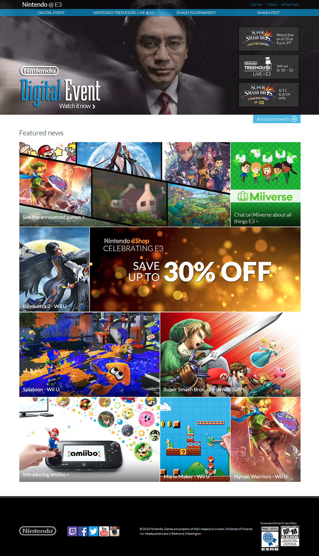
Homepage featuring masonry layout filled with promo art. I art directed the compilation of video loops to feature in the headers across the site.
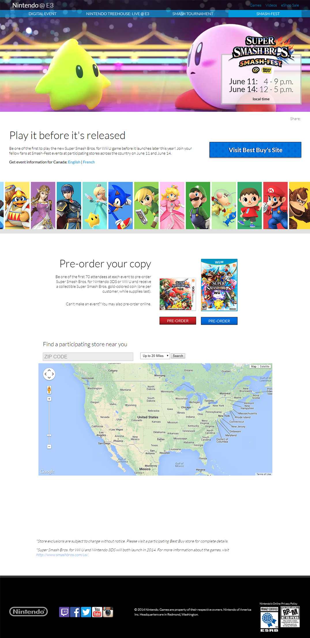
"Smash-Fest" event landing page screenshot which featured a video clip from the Super Smash Brothers game trailer in the header and animated character line-up.
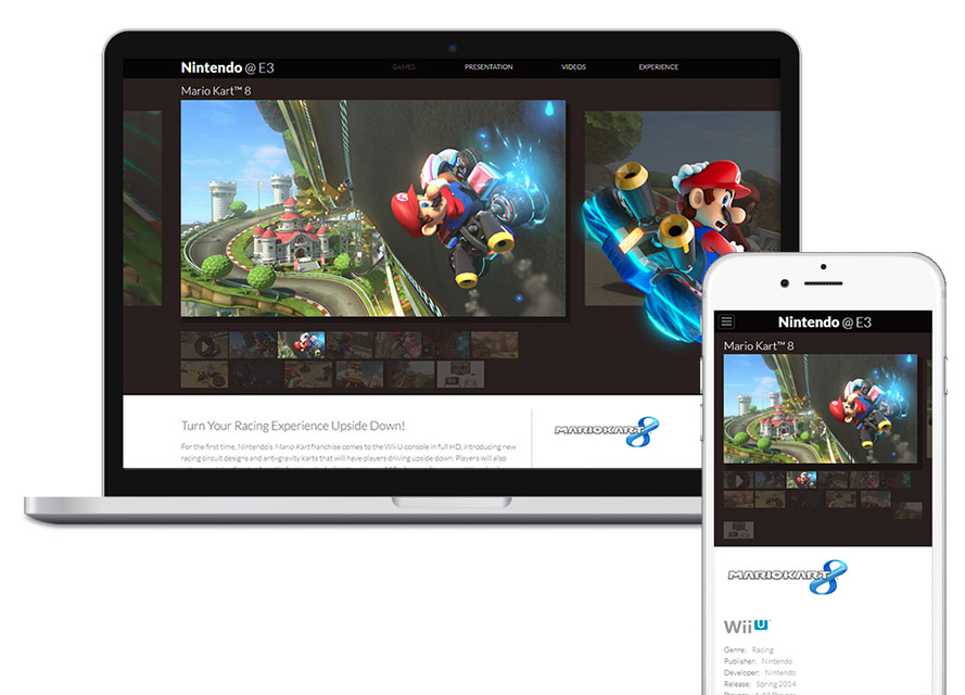
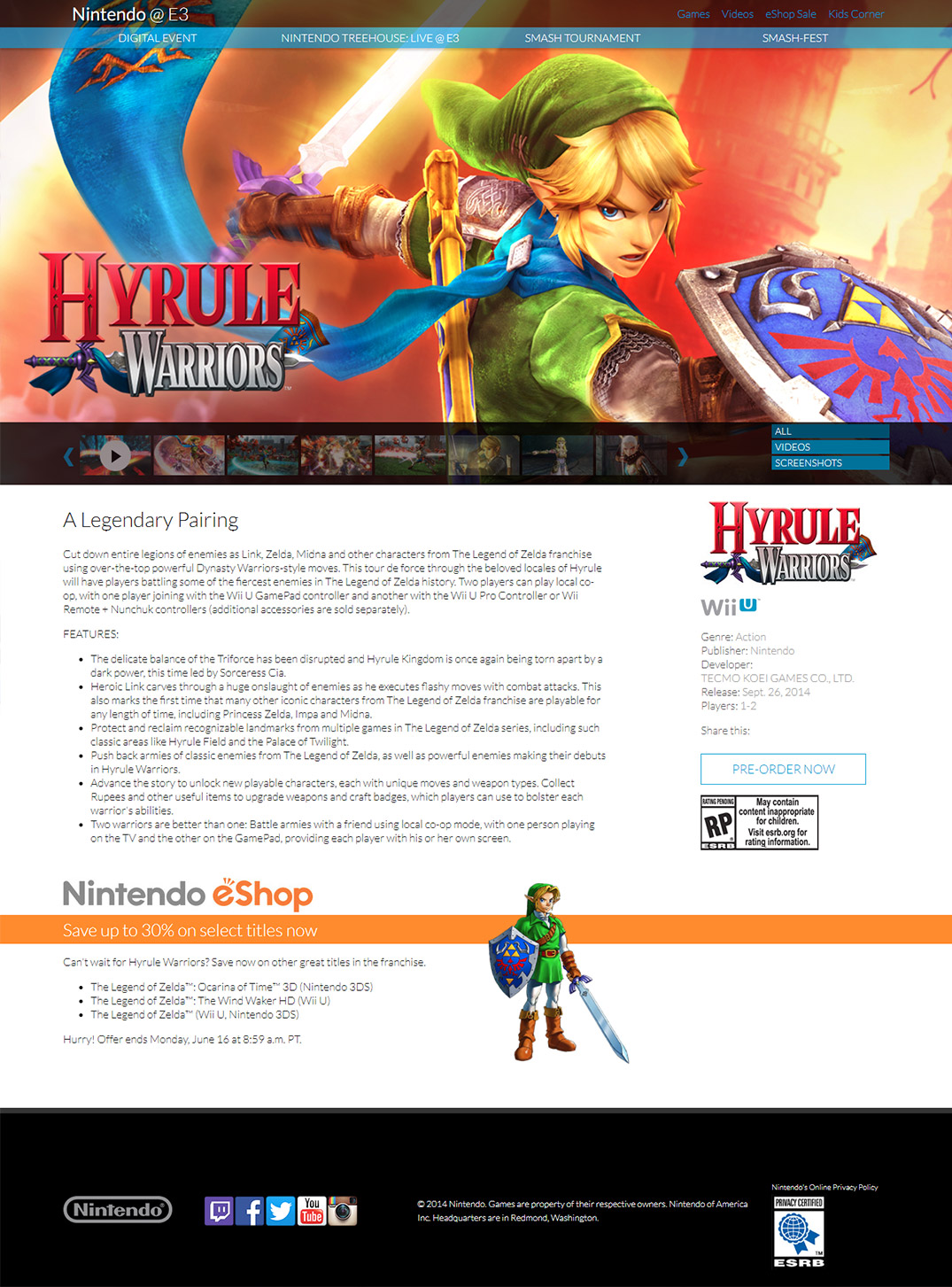
Game detail page screenshot, featuring filters and carousel navigation for the gallery thumbnails to solve for 2013's multi-row thumbnails issue.
1. Layout was flexible enough to accomodate the final assets and support changing priorities.
2. Stakeholders appreciated the video clips brought onto the pages and felt that it added excitement.
1. It was hard to tell at a glance which games were for which specific platforms.
2. On the homepage it was difficult to parse out which of the masonary boxes led to a game
detail page, and which ones led to event-specific landing pages.
My role was as lead designer, working closely with the development team and project manager.
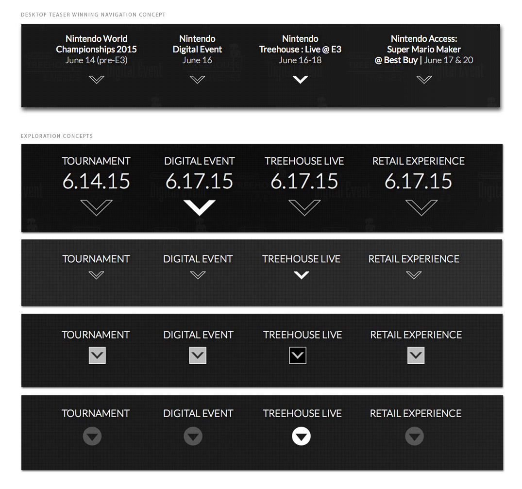
Create a site for Nintendo at E3 2015 that has a teaser phase and an event site phase.
1. Instead of having a teaser site and a separate
event site, make one phase transition into the other so that it's all
part of a single experience.
2. The event site should be both where fans are going to get information
and where fans are staying to watch streaming events.
1.We had a lack of assets that could be used for the teaser phase of the site.
2. Without knowing what the events, games or announcements were going to be it was hard to
think of a theme that could carry between the teaser phase and the events phase of the site to
tie the two pieces together.
3. We knew that streaming was going to be a key component of the site, but weren't sure
how or where the stream was going to be hosted.
1.Since there was video footage, trailers and other media assets from the previous year and
there was going to be a strong emphasis on streaming content, we would leverage video as a large
visual component of the site.
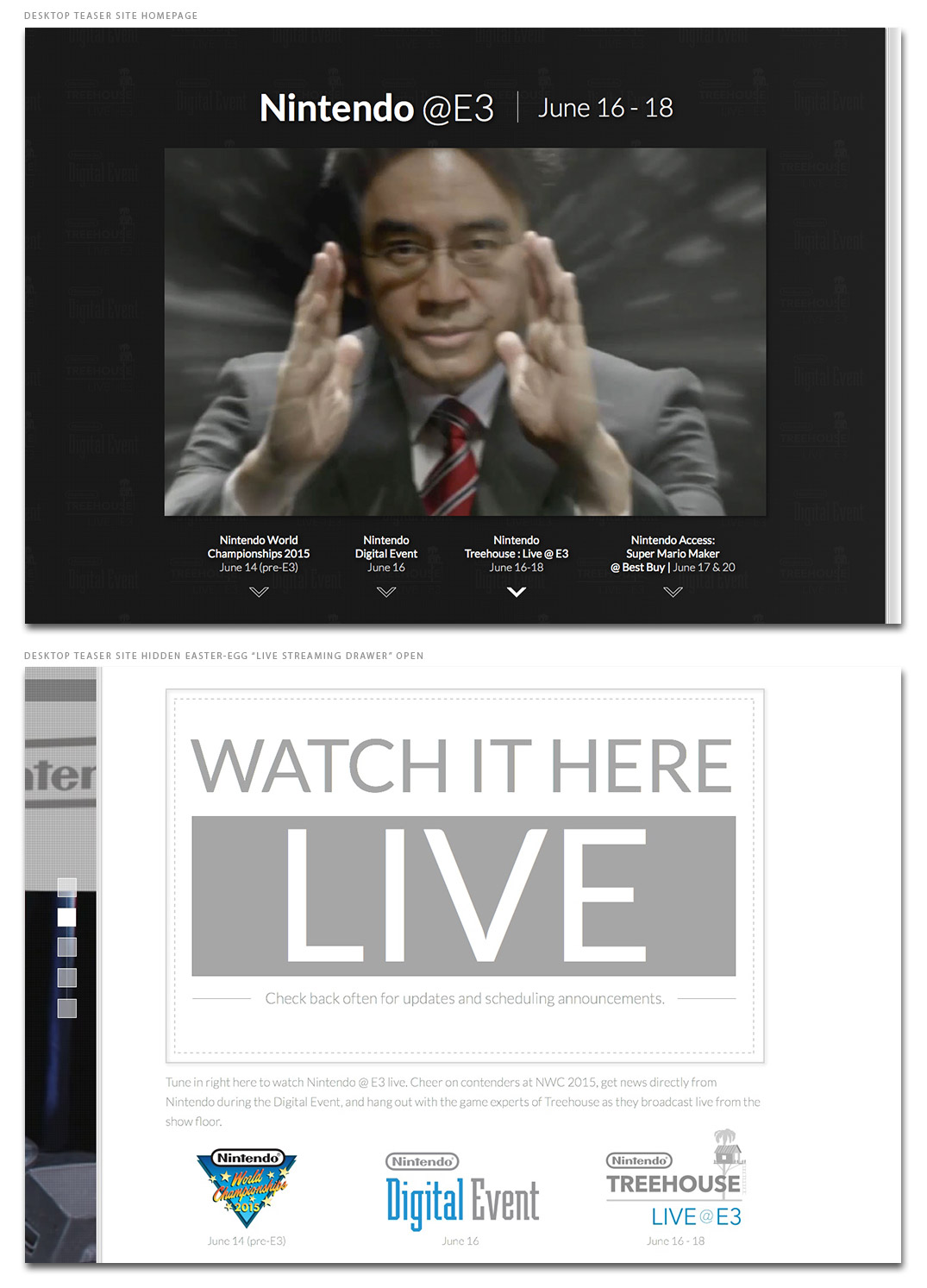
2. To mask the low quality of some of our assets, we would use a "screen" and "glass" theme /
visual treatment to tie the teaser site and the live event site together.
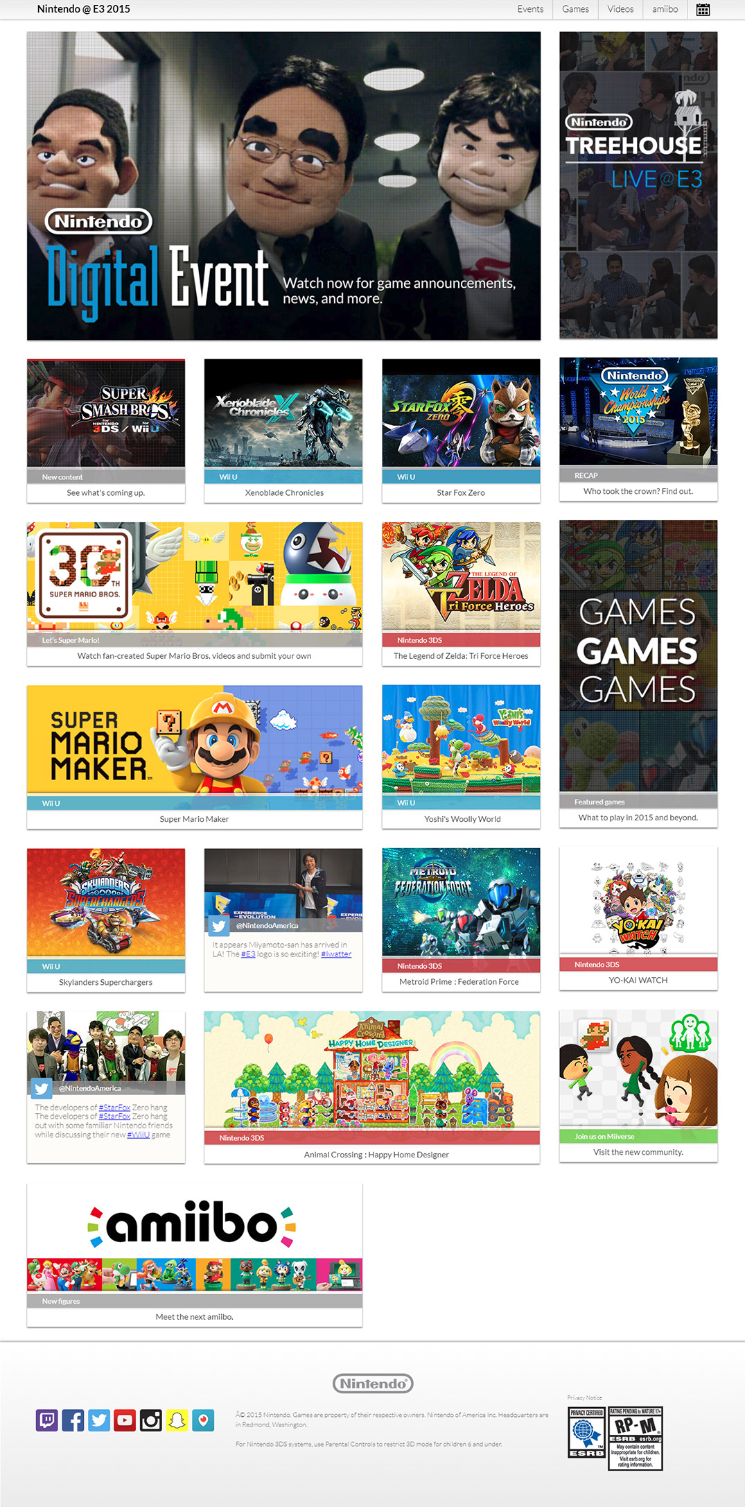
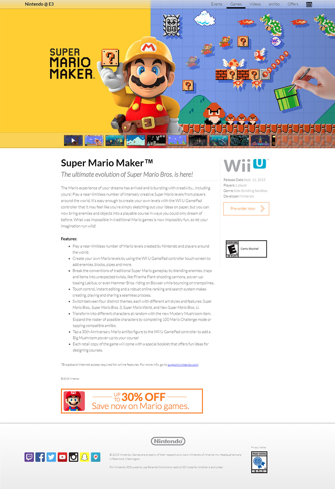
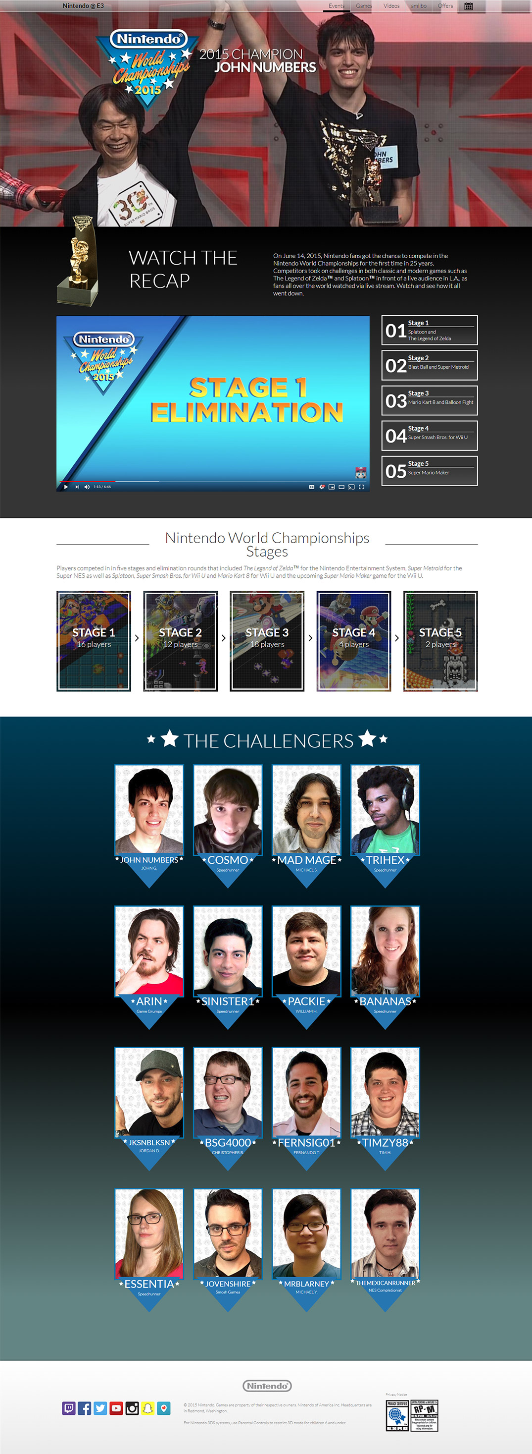
Various comps from designing the 2015 E3 event site and supporting promotional assets.
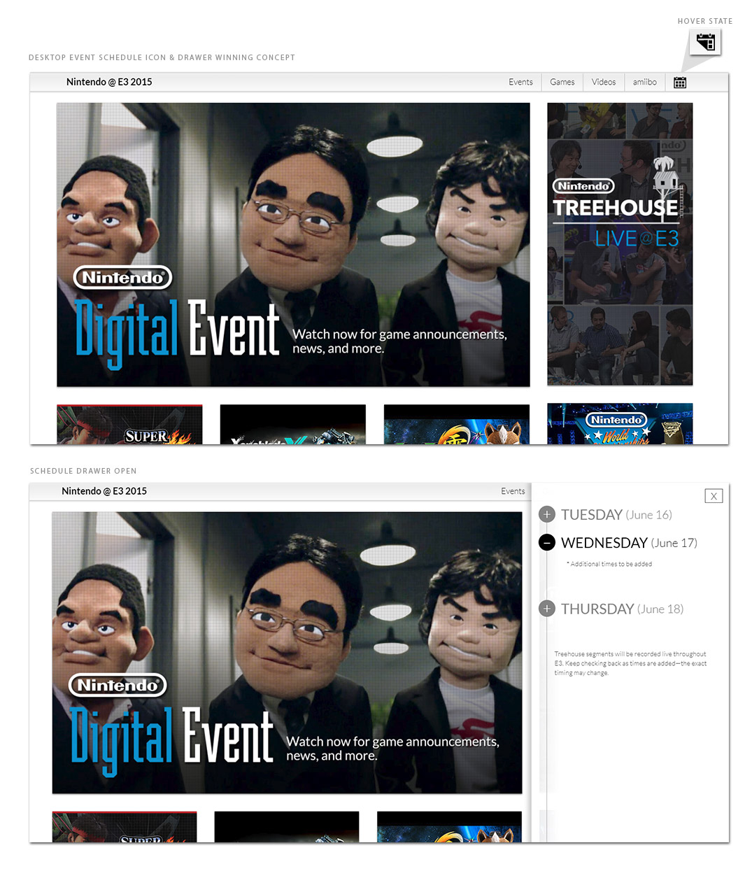
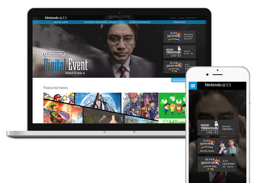
Screenshot of the homepage from the live event site, featuring promo art that I designed for every content tile.
Screenshot of the game detail page from the live event site.
Screenshot of the Nintendo World Championships 2015 recap page from the live event site.
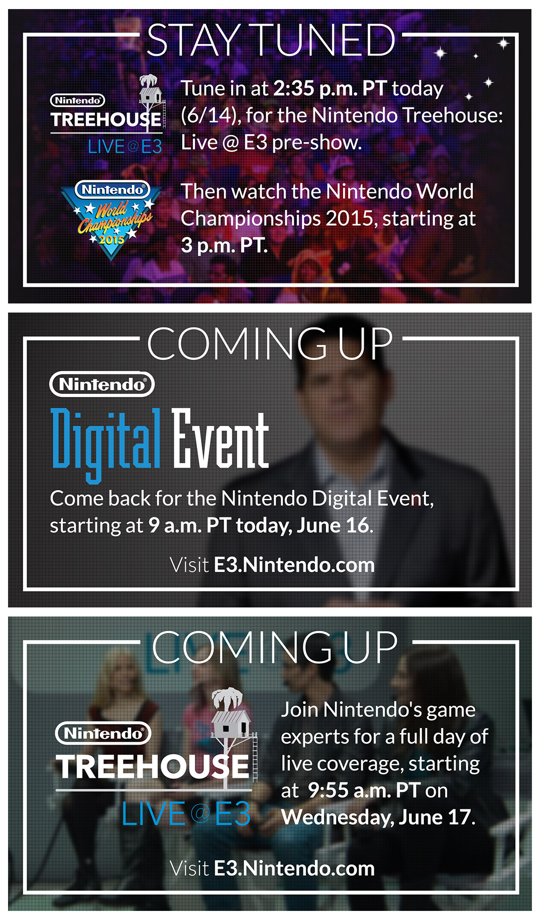
Graphics used for interstitials on the Twitch channel when live events were not streaming. Since we did not have assets to leverage for these designs, each one was created by taking a screenshot from a livestream, event trailer or video and treating it with visual effects.
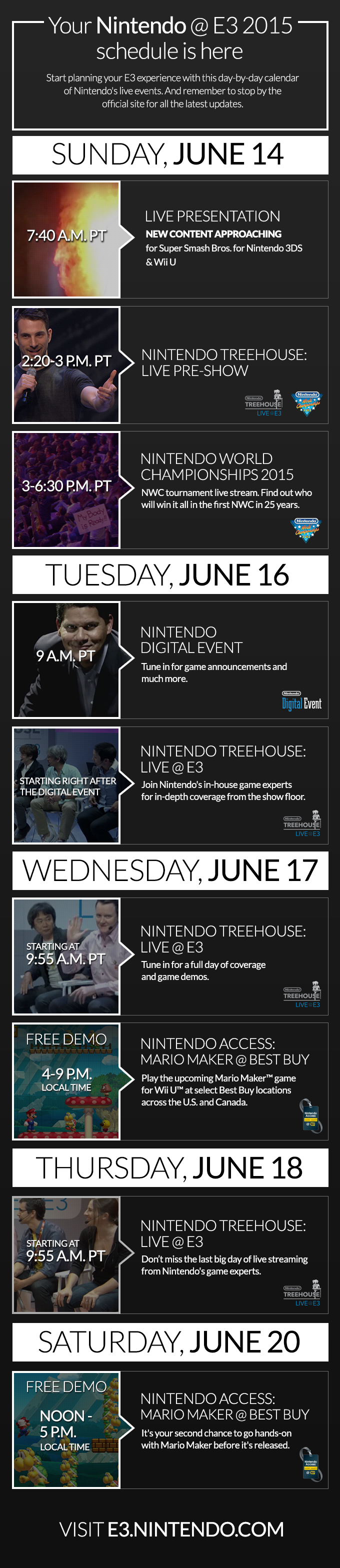
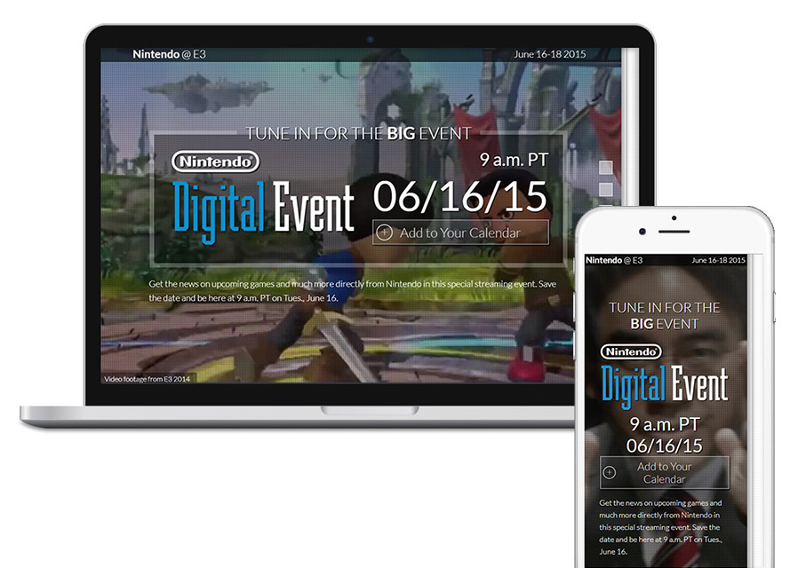
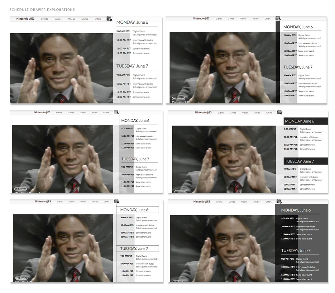
Graphic that I designed, working with our marketing manager to help fans keep track of Nintendo related E3 events. This was sent out through email and available on social media channels.