CarRentals.com (Expedia)
I was brought on to the team as a Senior User Experience Designer, on a short term contract with the CarRentals.com team at Expedia.
Shortly upon arrival, I was assigned my first mission!
The Ask
Do a comparison + analysis of the US and European CarRentals.com sites versus competitor sites and identify areas that needed user experience improvements.
The GOAL
From the list of UX/UI improvement suggestions, organize the list to separate out the tasks by lowest level of effort with the highest impact, to projects with the highest level of effort. The list was then used to create an actionable plan so tasks could be completed over multiple sprints.
Suggested UX/UI Improvements
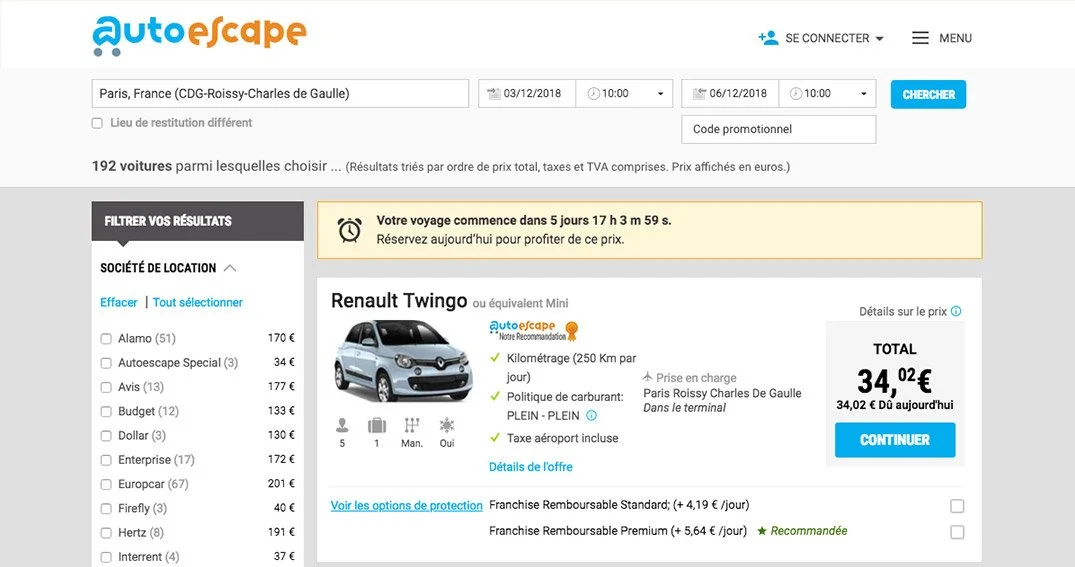
UX/UI improvement suggestions that I came up with after performing the comparison analysis and site audit are shown below.
Design for UX/UI Changes
Working as part of the CarRentals.com team was very different from all my previous roles as the majority of designs that we worked on were small incremental changes to the site which were queued to be tested for months before a determination would be made on whether to implement the design.
The Ask
Take the list of UI/UX suggestions and design solutions for each one, working with the product owner, design team and A/B testing team to determine which designs should be tested against each other.
The Goal
Produce multiple good solutions for each UI/UX challenge and narrow down the options to the best testable candidates.
Payment Options
Shown below are some of the design options that I had created for the UX/UI suggestion of making the payment options more clear by bringing the filters to the top of the search results page.
One Solution for Three Languages
One of the biggest challenges that I encountered working on these designs, is that often times what would be implemented for the US site would also be implemented for the European sites. This meant that the solution would have to work across all three sites, supporting three different languages.
Some of the designs below were exploring how to rework the search header so that was more clear and intuitive.


